One thing I have found in my time analyzing the markets is that investors love to overcomplicate things. We seem to think that a process that is more complicated is somehow more effective! Meanwhile, my own technical analysis checklist starts with a very simple question. I look at the chart and ask myself, “Is this chart going up, down, or sideways?”
You may laugh at the simplicity of this question, based on Charles Dow’s original work defining trends and identifying those patterns in stock prices. In 2023, as in 1923, and as I’m sure will be the case in 2123, prices move in trends. The reality is that when we skip this crucial first question, we can often get into trouble because we neglect this most basic of technical assessments.
Stan Weinstein (whose classic book is featured in the technical analysis section of our Recommended Reading List!) took this argument further with his “Stage Analysis” work, which classifies stocks based on their trend characteristics. My own approach groups charts into three general buckets, based on my assessment of the price trend. To be specific, any chart can be described as going up (the accumulation phase), going down (the distribution phase), or going sideways (the consolidation phase).
In this article, I’ll review the characteristics of each phase, what makes them unique from the other phases, and how a savvy investor can best trade stocks in each bucket.
The Accumulation Phase: GOOGL
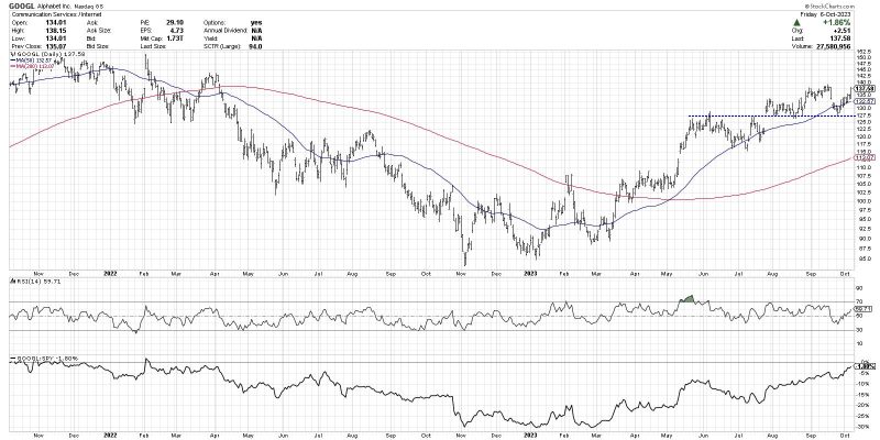
While our major benchmarks have shown clear signs of distribution, stocks like Alphabet Inc. (GOOGL) continue to show consistent signs of strength. This phase is marked by a clear uptrend of higher highs and higher lows, just as Charles Dow explained in his essays over a century ago.
A key aspect to this phase is that the swing lows keep getting higher. This suggests that investors are “buying the dips” and using short-term pullbacks as an opportunity to add to existing positions. Most recently, GOOGL found support around the $127.50 level, which lines up nicely with the August lows as well as the high from early June.
Note how the price is above two upward-sloping moving averages, which speaks to the well-established uptrend that continues to drive prices ever higher. The price momentum, as reflected by the RSI (second panel), is strong but not excessive. In a bullish phase, the RSI will usually come down to around 40 on a pullback, but rarely go any further down.
Finally, and perhaps most impressively, the relative strength (bottom panel) continues to drift higher. This tells us that the stock is outperforming the S&P 500, and, therefore, is truly helping our portfolio’s performance. It’s always a good idea to look for stocks with strong relative strength characteristics, and in a corrective market environment, it is absolutely vital to your portfolio’s well-being!
Ideally, we can identify charts that are just entering the accumulation phase. But for charts like GOOGL, already into an established uptrend, I find the best approach is to ride the uptrend until the chart tells you it’s over. As many traders have said over many years, “The trend is your friend.”
The Distribution Phase: SBUX
It’s not too hard to find stocks that are in a distribution phase, with the Consumer Staples and Communication Services sectors providing the most plentiful examples here in late 2023. Charts in this phase are experiencing lower highs and lower lows, as we see clearly displayed for Starbucks Corp. (SBUX).
As long as the chart continues to make lower lows and lower highs, the downtrend is considered intact. Trendlines can often provide a good visual representation of the pace of the decline and offer a good signal of a potential reversal. Note how the trendline using recent swing highs lines up well with the 50-day moving average, currently around $96.50.
While GOOGL was above two upward-sloping moving averages, here we find the price is below two downward-sloping moving averages. Even though there are brief countertrend bounces to the upside, the negative slope to the moving averages speaks to the consistent downtrend at play here.
Since the May peak, the RSI has fluctuated between the oversold level (below 30) on down moves and the 60 level on upswings. In a bearish trend, the range of the RSI usually moves down to this range, which confirms the overall negative momentum characteristics.
The relative strength line continues to slope downwards, telling us that SBUX is underperforming the benchmark. This means that not only are we losing money in absolute terms, but we’re also doing worse than owning a passive index fund.
Charts in the distribution phase are usually best avoided until there is some sign of accumulation. A higher low, a break above trendline resistance, a move above the 5-day moving average, an RSI reading above 60, and a reversal in the relative trend could all signal an exit from the dreaded distribution phase.
The Consolidation Phase: TSLA
Now we come to a group of stocks that are going neither higher nor lower but in a sideways direction. The market is telling us that the stock is fairly valued, and until some new catalyst comes into play, there is likely to be no real change in the picture.
Observe the pattern of lower highs and higher lows, often called a symmetrical triangle or “coil” pattern. The middle of this pattern is around $255 (which we call the “equilibrium price”), and basically the market is overshooting and undershooting this price level.
The two bottom panels show that the momentum is basically neutral, represented by an RSI reading right around 50. The relative strength line is flat, telling us that this stock is basically moving in line with the broader equity markets over the last three months. So we have an absence of strong momentum and as well as an absence of outperformance!
In some ways, this is the easiest phase to play, because at some point the coil pattern will be completed. If the price breaks above the upper boundary, that would indicate that buyers are taking control and are willing to pay more for the stock. If the price drops below the lower boundary, that would suggest that there is a lack of willing buyers or additional selling pressure. Usually, a stock breaking out the consolidation phase can soon be relabeled as an accumulation or distribution phase, based on the direction of the breakout.
If you’re considering a list of stocks or ETFs in your analysis, it may help to start by defining the phase of the charts. Gather the accumulation, distribution, and consolidation phases together, then drill down further into each bucket. By bringing this structure to our analytical approach, a mindful investor is able to focus in on the most actionable charts regardless of the broader market environment.
Want to digest this article in convenient video format? Head over to my YouTube Channel!
RR#6,
Dave
P.S. Ready to upgrade your investment process? Check out my free behavioral investing course!
David Keller, CMT
Chief Market Strategist
StockCharts.com
Disclaimer: This blog is for educational purposes only and should not be construed as financial advice. The ideas and strategies should never be used without first assessing your own personal and financial situation, or without consulting a financial professional.
The author does not have a position in mentioned securities at the time of publication. Any opinions expressed herein are solely those of the author and do not in any way represent the views or opinions of any other person or entity.


